This article is Chapter 8 in The Currency Companion, Supplement #1.
Overview
In general, arbitrage is the purchase or sale of a financial instrument with the simultaneous taking of an equal and opposite position in a related market, in order to take advantage of small price differentials between markets. Arbitrage opportunities arise when currency prices go out of sync with each other. There are numerous forms of arbitrage involving multiple markets, future deliveries, options and other complex derivatives. A simple example of a two-currency, two-location arbitrage follows.
Bank ABC offers 170 Japanese yen for one US dollar and Bank XYZ offers only 150 yen for one dollar. Go to Bank ABC and purchase 170 yen. Next go to Bank XYZ and sell the yen for $1.13. In a little more than the time it took to cross the street separating the two banks, you earned a 13% return on your original investment. If the anomaly between the two banks’ exchange rates persists, repeat the transactions. After exchanging currencies at both banks six times, you will have more than doubled your investment.
Within the FOREX market, triangular arbitrage is a specific trading strategy involving three currencies, their correlation and any discrepancy in their parity rates. There are no arbitrage opportunities when dealing with just two currencies in a single market. Their fluctuations are simply the trading range of their exchange rate.
We mention this because in many ways the following analysis of the USD as a leading indicator resembles polygonal arbitrage, that is, numerous USD currency pairs and cross rates examined at the same time.
Cross Correlations
We can tell from simple observation that numerous currency pairs move in cadence with each other. For example, examine the following two OHLC charts:
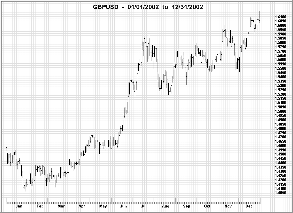
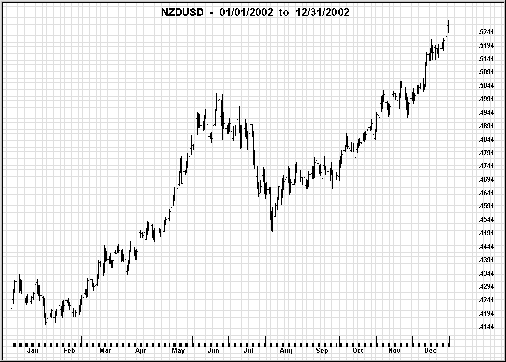
Both charts clearly show the same overall upward trend. However, the first appears to start an abrupt upward breakout in early May that does not appear in the second chart until June. It is exactly these temporal shifts between currency pairs that we wish to explore, to determine which pairs are leaders and which are laggers.
Preliminary Tests
Before testing for leading and lagging properties of USD currency pairs, we want to perform one preliminary operation on the major USD currency pairs: a cross-correlation to determine how closely various pairs match each other’s price movements.
For this we use daily closes for the period 1/1/02 through 12/31/02. Because of the diversity in the range of parity rates (1 GBP = 1.56 USD while 1 NZD is only 0.49 USD), we must first massage the raw data into normalized Z-statistics:
Z-Stat (x) = (Price(x) – Mean) / StdDev
This transformation molds the raw data into a sequence ranging from +4 to –4 while breakouts and reversals are left intact temporally. Additionally, where the USD is the base currency in the pair, the inverse reciprocal of the daily close must be used prior to normalizing the data. An ordinary least squares regression is then used to calculate the coefficient of correlation between selected USD currency pairs.
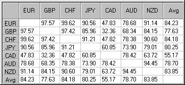
This table shows how closely the closing prices of one USD currency pair match the closing prices of another over the same period. For example, the highest coefficient of correlation between any two pairs in the table is 99.62% (row 1, column 3), for EURUSD and USDCHF. This is confirmed by the fact that the corresponding cross rate, EURCHF, has the lowest coefficient of variation (standard deviation) of all the major cross rates (see Part 2).
Very unexpected is the coefficient of correlation of 32.36% for GBPUSD and USDCAD (row 2, column 5). In fact, the average correlation for the fifth row (or column) shows that the Canadian dollar marches to the beat of a different drummer.
Testing Approach
We hope to develop some trading rules that can be applied while monitoring live data in the dealer’s trading platform. So we start with the smallest non-streaming, equi-spaced time interval: one-minute data. We target a single currency around which the analysis will revolve. Since the USD is the most heavily traded currency, the target currency is the USD.
Our hypothesis is that certain USD currency pairs will lead other USD currency pairs in price movement. This information can be very profitable on a trading platform that allows the trader to display multiple charts simultaneously and to execute orders in less than 5-10 seconds.
Next we must select which foreign currencies to include. We wish to test, for example, whether, if the GBPUSD begins a sharp downward reversal, the AUDUSD will exhibit the same price movement after 1 minute, after 2 minutes, or as a gradual move after 10 minutes. Or is the AUDUSD totally unaffected by sharp changes in the GBPUSD?
- What to test? Abrupt breakouts would be valid criteria for testing our hypothesis.
- How to test? Choose the primary pair, the pair suspected of being the leading indicator (GBPUSD). Select a secondary pair suspected of being a lagging indicator (AUDUSD).
- When to test? After checking the GBPUSD activity charts, we find the pair is most active between 8:00 AM and 1:00 PM Monday to Friday. With increased activity comes increased volatility, and so we expect a greater number of significant breakouts and reversals. Of course, the contrary opinion is that leader/lagger relationships are most likely to occur when the leading banks are open and the lagging banks are closed.
Next, loop through the 1-minute interval data and log where the absolute value of the 3-minute momentum index is greater than, say, 15 pips. We define an x-unit momentum index on day n as:
Mom(n) = Price(n) – Price(n – x)
Record these occurrences by time and momentum (for example, 8:07 +18 pips, 8:08 +20 pips, 8:11 –21 pips, 8:12 –19 pips). Next perform the same operation on the AUDUSD pair and compare the results.
Leader/Lagger Chart Properties
In our first experiment we take the EURUSD as the leading pair and the AUDUSD as the lagging pair. We selected mid-July 2002 as a starting time frame simply because that period showed marked activity in the annual bar chart. As an overview we chose the 4-hour time frame from 8:00 AM to noon EST:
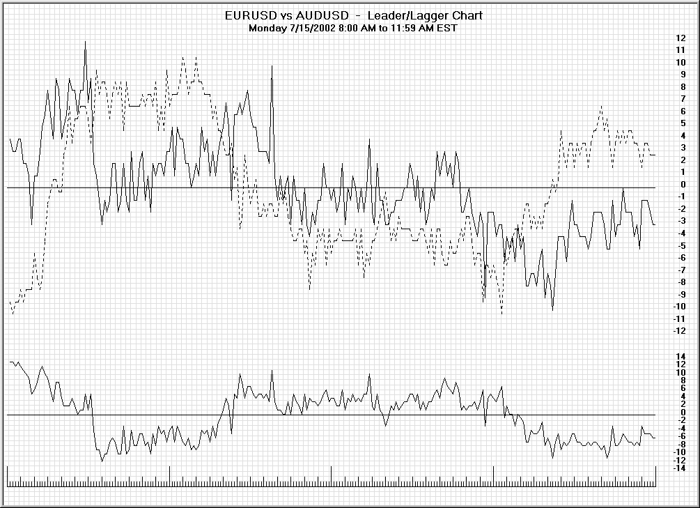
First, the anatomy of the leader/lagger chart. The upper portion displays two time series. The series plotted in bold is the assumed leader (EURUSD) and the assumed lagger (AUDUSD) is plotted with a segmented line. Both currency pairs have been de-meaned over the 4-hour time frame and oscillate around the horizontal central line. The series in the lower portion is the difference between the two pairs (leader minus lagger).
To scrutinize this period in greater detail, we have divided it into four charts, each covering one hour:
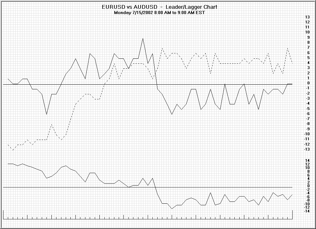
The horizontal scale is divided into 1-minute intervals. At the ninth interval (8:09 AM), the EURUSD begins rising from below the median line to above it. The AUDUSD does not start an analogous advance until two minutes later.
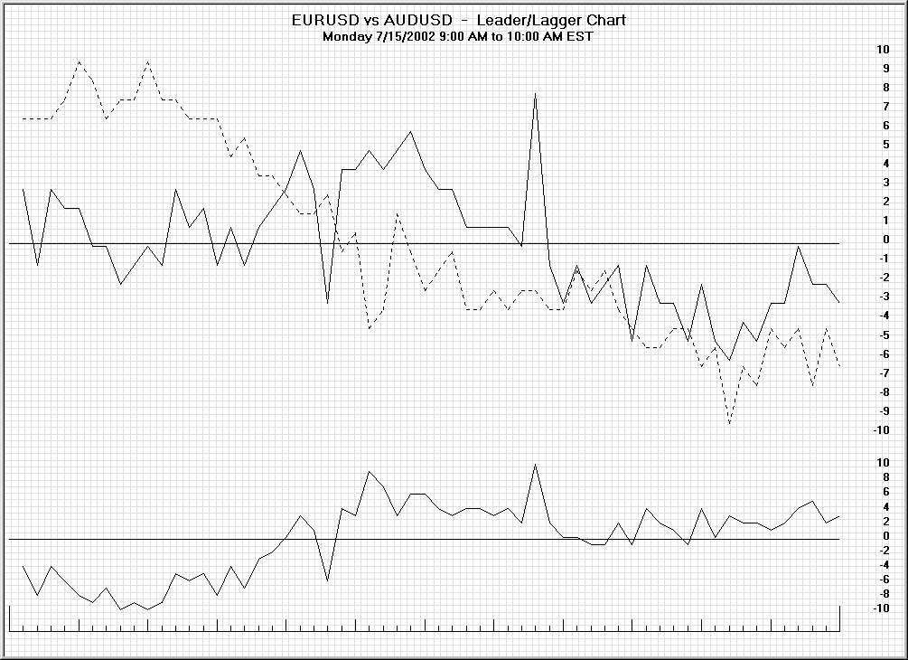
In the chart above we see a downward move in the EURUSD at 9:22 AM. The analogous downtrend in the AUDUSD continues until 9:28 AM.
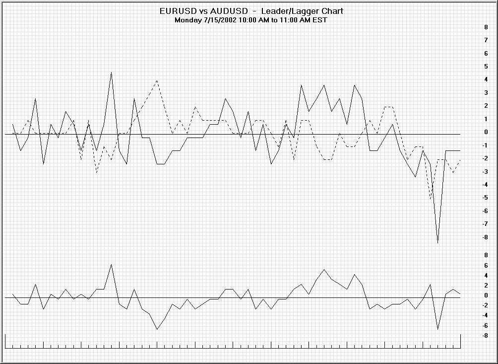
At 10:16 AM the EURUSD rose from below the median and continued above it. The same rally in the AUDUSD continued through 10:23 AM.
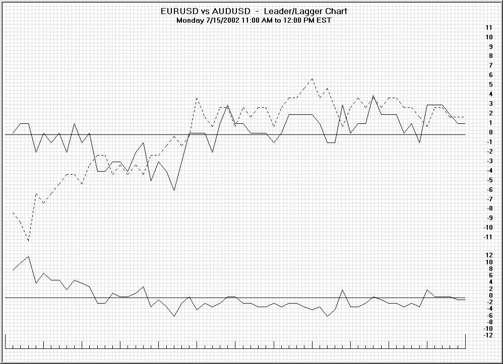
At 11:48 AM a downtrend began in the EURUSD. The analogous downtrend in the AUDUSD did not begin until three minutes later.
The five charts above assumed the EURUSD is the leading pair and the AUDUSD the lagging pair. Note that the coefficient of cross-correlation is only 78.68%. The next charts examine the identical time period using the NZDUSD as the lagging pair. The higher coefficient of correlation between EURUSD and NZDUSD (91.14%) tells us these two pairs are more closely matched, increasing the chance of more leading/lagging relationships:
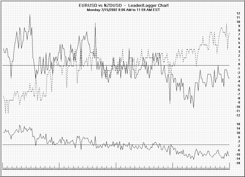
Again, this chart was plotted simply to reveal the overall characteristics of the four-hour time frame.
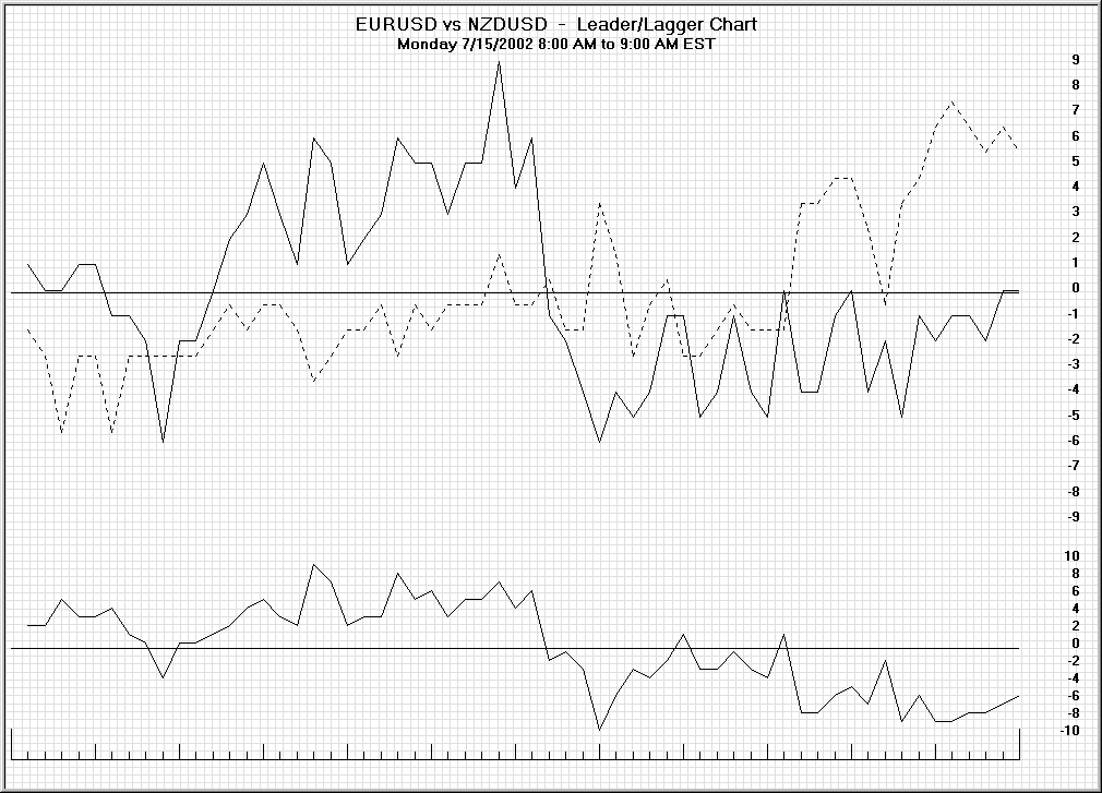
One possible leading/lagging opportunity may exist at 8:45 AM in the chart above.
Continue with Part 2: the Difference Oscillator and the leader/lagger trading strategy.
This post is educational commentary. It is not investment advice. Trading futures and FX involves substantial risk of loss.
Good Trading!
Michael Duane Archer
Related Reading
- Leading and Lagging Currency Pairs, Part 2: A Scalping Strategy
- Indicator Battery: Combining Moving Averages and Momentum
- Bar Chart Stat Pro: Statistics of the Next Bar (Bucket List, Part 2)
Keep Learning the Goodman Way
If this article was useful, these are the next steps:
- The Method: propagation, intersection and the 3-C Principle, drawn plate by plate.
- The Goodman Library: the books, from Goodman for Grasshoppers to The Goodman 6 & 6.
- The Trader’s Playbook: the Molokai setup in one printed, numbered volume.
- Mentoring: work one-on-one with the authors.